Details
Links
Miami County Fair Banners


A massive undertaking consisting of little more than 334 banners of 4 different sizes (and shapes)—all with their own award names and sponsors—this year's Miami County Fair banner designs exemplify the hard work and dedication it takes to make it to the top and succeed. The theme for this year's fair was "MVP," which is just the perfect excuse for some gaudy pomp & circumstance.
Process
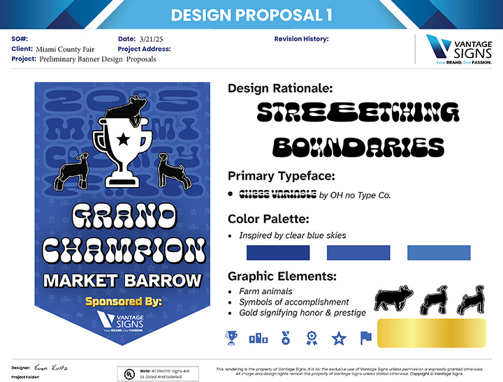
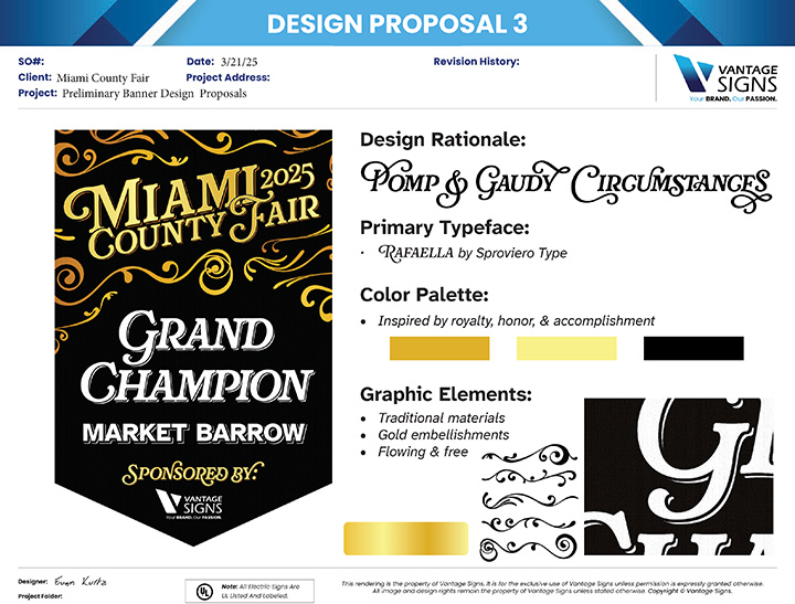
The client wanted to see 3 unique designs satisfying the theme of MVP. Each banner would have an award designation, an award category, and a sponsor, so I knew typography was going to be an important aspect of each design. With that in mind, I went scouring Adobe Fonts for inspiration. The three main typefaces I landed on were Cheee Variable by OH no Type Co., R41 Etoile by Reber R41, and Rafaella by Sproviero Type.
I'd been saving the Rafaella typeface for a while to use for something worthy of its aesthetic, so I knew that would end up being central to one of the designs. I found R41 Etoile next and thought it looked very fun and modern—a good contrast against the very traditional style of Rafaella. To fill the gap between clean and proven, I picked Cheee Variable to represent the new age of design and talent. More so, I had been wanting to use a typeface by OH no Type Co. and found in Cheee an excuse to try my hand at designing some stretched type.
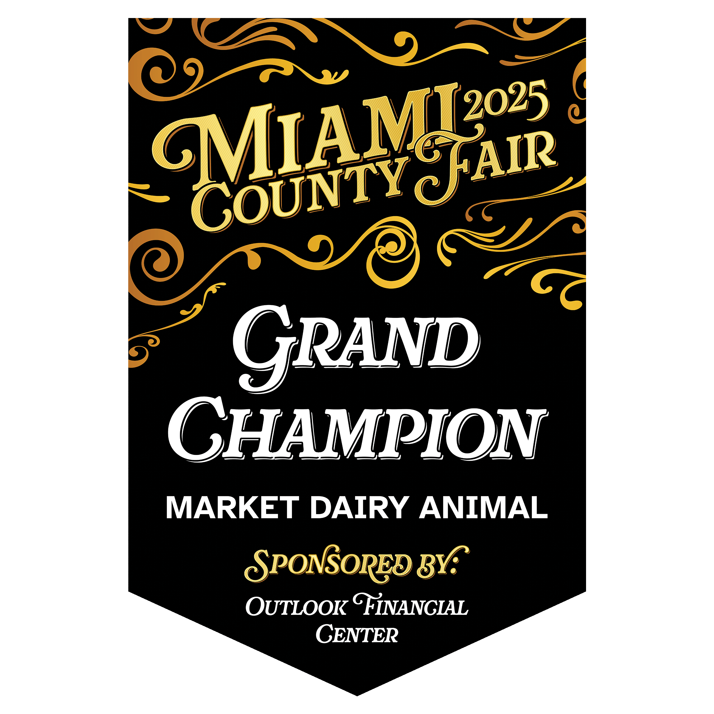
Though I felt strongly for each of my designs, I knew beyond a doubt that Design Proposal 3 (with Rafaella) was the clear winner. I had allotted more time to that design than the other two combined—I can't say why exactly, but I knew I was on to something, and it would take a lot of time to pull it off. Now, I'd be surprised if you haven't come across this Rafaella typeface; I've been seeing it a lot in the last couple of years. It is a very enticing and intricate font with a heaping ton of alternative glyphs for each letter, capital or otherwise. It has a lot of potential. But very rarely is it ever pulled off, in my opinion.
Rafaella works so well in this context because it is paired with and complemented by the regal, flowing nature of the chosen aesthetic. With the logo canted up and to the sky, it portrays a sense of motion—of success and excellence, moving forward and blazing one's own path. The swirling decorative embellishments surround and reinforce this motion, creating an implied boundary header for the composition. If you squint your eyes, it sort of looks like a magical crystal hanging from the ceiling. Rafaella ties all of this together with its swooping serifs and background shading lines (it has two styles, bold and bold shadow; without this shadow, the gold loses its depth, and the detailing in the main faces has nothing to contrast against).
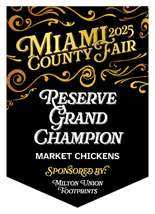
The rationale for the other two designs is pretty straightforward—"Stretching Boundaries" and "Sparkling Contemporary Fun," where the former allows the institution of the fair to take a back seat in appreciation of the youth and talent being awarded for their efforts, while the latter celebrates the present.

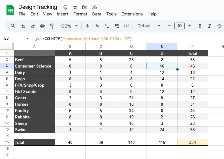
Before I joined Vantage Signs, these banners had become a dreaded project guaranteed to be rife with crunch and overtime. After I was debriefed about the chaos that the logistics would become, I figured we should get ahead of the deadline and figure out how we can handle this efficiently and, if at all possible, elegantly. The solution I came up with takes advantage of InDesign's parent pages and alternative layouts. If you break down the design of each banner, you can isolate instances of assets and keep everything organized in a single file. This, of course, proved a little more challenging than even I expected. I broke up the files by award category (e.g. Beef, Horses, Swine, etc.) and created a spreadsheet to track progress. I made a base template file to keep everything standardized across categories, but in retrospect, I probably should have utilized InDesign's Book or Libraries file types instead. Little did I know, though, that organizing everything like this saved our hides.

There will always be mistakes when working on huge collaborative projects like these. When word came back from the client letting us know which design they had chosen, my coworker gently told me they had chosen the purple one (with R41 Etoile). I was disappointed, I'll admit—I thought, even with the subjectivity of art and design, surely the Rafaella design was the objectively best design. Oh well... We move on and work to realize the client's ideas. Eventually, I had everything exported and ready for proofing; it was a few days before we needed to start printing these banners. The client was confused, "I thought we had decided on Design 3?" Turns out my coworker had assumed they meant the third sequential design in the proposal, which, if you included the Design 1 Alt, meant Design 2. Of course, they had actually picked Design 3—the Rafaella one. Despite the sweat and tears that it took to make this swift correction, I couldn't be mad. I love this design, and I was excited to be able to bring it into the world.
By the way, my coworker apologized profusely and helped crunch with me to get this sorted. I couldn't have been able to do this without her help.
Everyone say "thank you, Anna!!!"
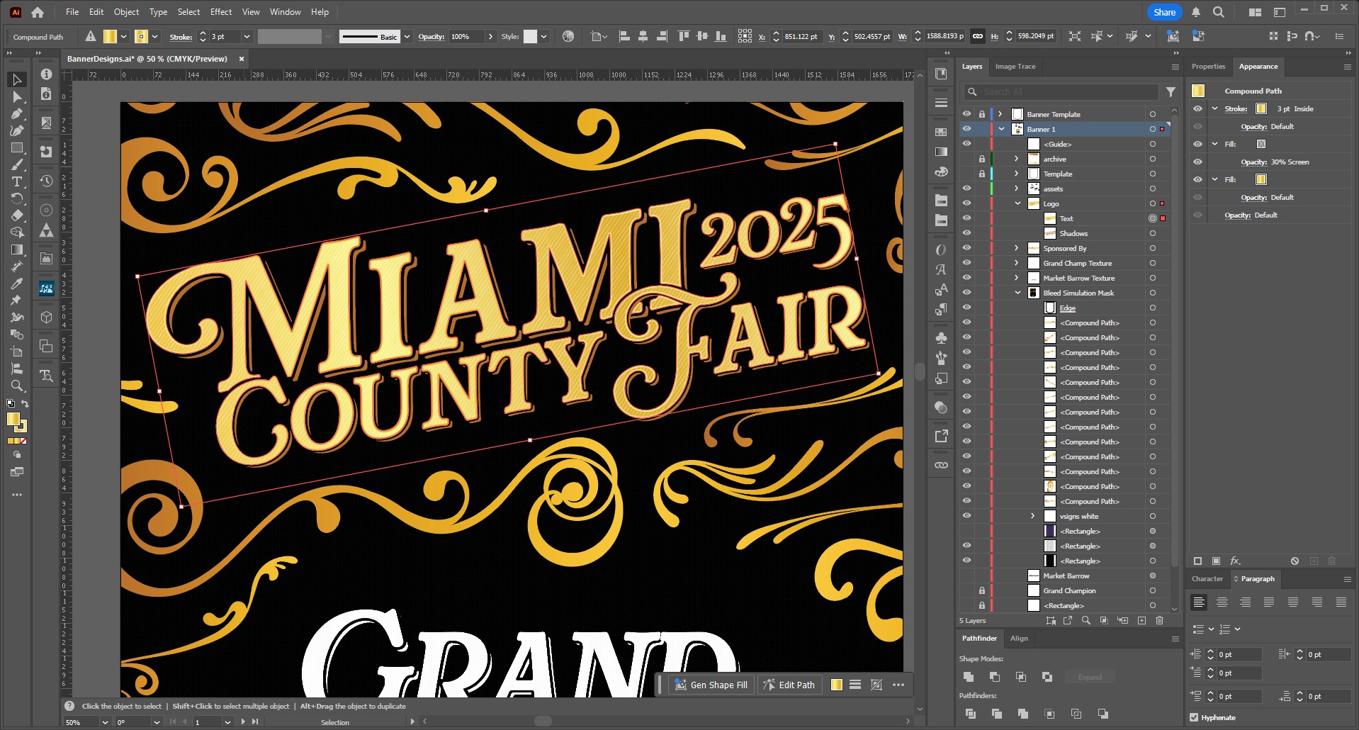
Each of the logos in the design proposals took great advantage of Illustrator's Appearance panel. If you use Illustrator and have been sleeping on this feature, you seriously need to check it out. It allows you to create dynamic text effects—creating depth with a transformed and outlined fill layer and utilizing blending modes to insert detail into the faces of each character, all on live text. If you don't see how this can be worth the trouble of setting up the Appearance panel, imagine you've just spent hours working on a title and realize you made a spelling error. If the text had been outlined to layer these effects, or you had duplicates of the text blocks, you'd have to redo and touch each element, layer by layer. With the Appearance panel, you can just edit the text like normal, and the style updates in real time. It's incredible, and the only reason I think Illustrator is unrivaled despite its flaws (even though it pains me to admit such a thing).
I'll talk briefly about how the banner files were set up, because it's the reason we were able to pivot back to the Rafaella design in the first place. There are 4 banner types in total: the largest was 36"h x 24"w, in the style of a pennant; the second, also a pennant, was 30"h x 21"w; the third followed suit at 24"h x 18"w; finally, the last banner type stayed the same size, but was in the shape of a triangle.
I designed everything to-size in vector format, so I had to adjust the main design for each banner type. I exported the background, logo header, and sponsor assets separately and composited them in InDesign, taking advantage of parent pages so that if we needed to adjust anything, we only had to adjust the parent, and everything that inherited that style would update accordingly.
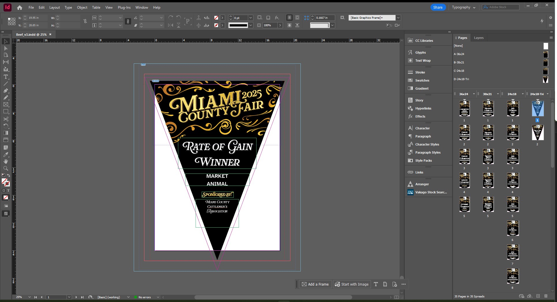
The brunt of the work (after the logo was complete, anyway) came from entering each award type and sponsor by hand. This is another thing I want to look into for next year. I'm pretty sure we can hook a spreadsheet into the InDesign document and do a data merge to avoid having to do all that clerical labor. Separating each banner type into alternative layouts in InDesign allowed us to target those layouts when exporting to simplify the export process. In the end, we ended up having printed over 350 banners—all on time and to the great satisfaction of the fair.